Typography
A defined hierarchy gives the identity a clear and repeatable voice.
 Let’s talk
Fora · Brand identity · Concept project
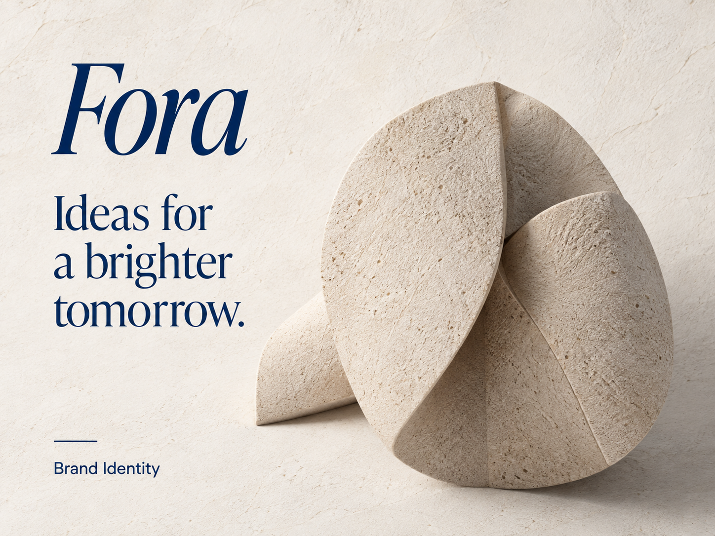
A focused visual language shaped through typography, color and imagery for use across digital and business materials.
The brief
The identity needed a clear foundation: a distinctive name treatment, a restrained color palette and consistent rules for how imagery and type work together.
Project scope
01 · Identity foundation
The identity pairs an expressive wordmark with a calm editorial structure. Each element has a clear role, so the brand remains legible and recognizable at different scales.
02 · Visual language
A defined hierarchy gives the identity a clear and repeatable voice.
Warm neutral surfaces create space for the deep blue wordmark.
Sculptural forms add character while keeping compositions restrained.
03 · Brand applications
The same typographic scale, color relationships and image treatment guide each application, without relying on a large collection of unrelated assets.
04 · Design principles
Make the identity immediately recognizable.
Give typography and imagery room to work.
Carry the same rules across materials.
Outcome
Fora's concept system brings its wordmark, palette, typography and image direction together in one recognizable visual language.
Deliverables
Identity direction · Typography and color guidance · Image direction · Application principles
LET’S GET STARTED
Share a few details and we’ll get back to you with the next step. No need for a full brief.
Prefer to email directly?
hello@yourdesignfiles.com